


What font should I choose for my thesis?
|
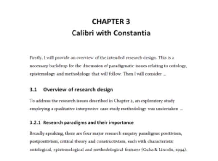
Posted By: Hija Chang on April 01, 2016 by Thesis Whisperer This post is by DrJanene Carey, a freelance writer and editor based in Armidale NSW. She occasionally teaches academic writing at the University of New England and often edits academic theses, articles and reports. Her website is http://www.janenecarey.com Arguably, this question is a classic time waster and the student who poses it should be told to just get on with writing up their research. But as someone who edits theses for a living, I think a bit of time spent on fonts is part of the process of buffing and polishing what is, after all, one of the most important documents you will ever produce. Just bear in mind that there is no need to immerse yourself so deeply in the topic that you start quibbling about whether it�s a font or a typeface that you are choosing. Times New Roman is the standard choice for academic documents, and the thesis preparation guidelines of some universities stipulate its use. For many years, it was the default body text for Microsoft Word. With the release of Office 2007, the default became a sans serif typeface called Calibri. Lacking the little projecting bits (serifs) at the end of characters makes Calibri and its many friends, such as Arial, Helvetica and Verdana, look smoother and clearer on a screen, but generally makes them less readable than a serif typeface when used for printed text. The other problem with choosing a sans serif for your body text is that if you want passages in italics (for example, lengthy participant quotes) often this will be displayed as slanted letters, rather than as a true italic font. You would like your examiners to feel as comfortable as possible while their eyes are traversing the many, many pages of your thesis, so maximising legibility and readability is a good idea. Times New Roman is ubiquitous and familiar, which means it is probably the safest option, but it does have a couple of drawbacks. Originally designed for The Times in London, its characters are slightly narrowed, so that more of them can be squished into a newspaper column. Secondly, some people intensely dislike TNR because they think it has been overused, and regard it as the font you choose when you are not choosing a font. If you do have the luxury of choice (your university doesn�t insist you use Times New Roman, and you have defined document styles that are easy to modify, and there�s enough time left before the submission deadline) then I think it is worth considering what other typefaces might work well with your thesis. I�m not a typographical expert, but I have the following suggestions. Don�t use Calibri, or any other sans serif font, for your body text, though it is fine for headings. Most people agree that dense chunks of printed text are easier to read if the font is serif, and examiners are likely to expect a typeface that doesn�t stray too far from the standard. To my eye, Calibri looks a little too casual for the body of a thesis. Typefaces like Garamond, Palatino, Century Schoolbook, Georgia, Minion Pro, Cambria and Constantia are all perfectly acceptable, and they come with Microsoft Word. However, some of them (Georgia and Constantia, for example) feature non-lining numerals, which means that instead of all sitting neatly on the base line, some will stand higher or lower than others, just like letters do. This looks nice when they are integrated with the text, but it is probably not what you want for a tabular display. Consider using a different typeface for your headings. It will make them more prominent, which enhances overall readability because the eye scanning the pages can quickly take in the hierarchy of ideas. The easiest way to get a good contrast with your serif body text is to have sans serif headings. Popular combinations are Garamond/Helvetica; Minion Pro/Myriad Pro; Times New Roman/Arial Narrow. But don�t create a dog�s breakfast by having more than two typefaces in your thesis � use point sizes, bold and italics for variety. Of late, I�ve become quite fond of Constantia. It�s an attractive serif typeface that came out with Office 2007 at the same time as Calibri, and was specifically designed to look good in print and on screen. Increasingly, theses will be read in PDF rather than book format, so screen readability is an important consideration. Asked to review Microsoft�s six new ClearType fonts prior to their release, typographer Raph Levien said Constantia was likely to be everyone�s favourite, because �Even though it�s a highly readable Roman font departing only slightly from the classical model, it still manages to be fresh and new.� By default, Constantia has non-lining numerals, but from Word 2010 onwards you can set them to be lining via the advanced font/number forms option, either throughout your document or in specific sections, such as within tables. Here is an excerpt from a thesis, shown twice with different typefaces. The first excerpt features Calibri headings with Constantia body text, and the second has that old favourite, Times New Roman. As these examples have been rendered as screenshots, you will get a better idea of how the fonts actually look if you try them on your own computer and printer. Source: http://thesiswhisperer.com/ If you enjoyed this article, Join HBCU CONNECT today for similar content and opportunities via email! |
 |
Hija Chang
Management, See Moss Interactive Bellarmine University class of 2021 Member Since January 2011 |
Comments
More From This Author
Latest Graduate School Info

 |
Graduate Student Fellowship Opportunity!We, at www.stemuscenter.org, just completed our first two informational sessions on Research Fellowship opportunity for STEM and Social Science doctoral students.
The mission of our center is to te ...more
Manisha Maurya • 2,103 Views • October 23rd, 2024 |
 |
4 Habits for Success in Online SchoolOnline education has become an increasingly popular option for students over the years, especially due to the current global pandemic. However, succeeding in online school takes more than just a good ...more
Anica Oaks • 2,405 Views • February 1st, 2024 |


Popular Graduate School Info
 |
People Judge Your Intelligence Based on the Tone of Your Voice and How Fast You Speak
Do you want people to think you are intelligent? Has someone ever told you �You�re much smarter than you look.�?
No doubt it can sting to be perceived as less intelligent, particularly when you ...more
Hija Chang • 32,559 Views • June 12th, 2017 |
 |
How to Improve Your Reading Comprehension If youd like to improve your reading comprehension, try the SQ3R method. This is an acronym that means: Survey, Question, Read, Recite and Review.
Heres how it works:
Survey Your Text
Prior t ...more
Hija Chang • 25,229 Views • June 12th, 2017 |
 |
Magna, Summa, and the Honor RollWhat does it mean to graduate with honors? Academic honors involve these Latin terms...
What is Cum Laude: Graduating With Honor means graduating cum laude. What does cum laude mean? Translators de ...more
Hija Chang • 24,566 Views • March 16th, 2016 |
 |
Never procrastinate and always free time�..One blog I read regularly is by Leo Babauta, called zen habits. Essentially, he writes all about simplifying your life. A while ago, Scott Young was a guest blogger for Babuata�s website and wrote a p ...more
Hija Chang • 14,199 Views • April 19th, 2018 |
 |
MVSU to host Graduate Expo March 1Why should you consider an advanced degree? How will you finance your graduate education? What program of study is the best fit for you?
For the answer to these questions and many more, attend Mis ...more
Hija Chang • 13,294 Views • February 27th, 2018 |